Michael A.
Beaumont Jr


"I am a passionate and self-driven content creator who operates well under pressure. I am based in the Philadelphia, Pennsylvania area. Aside from creating striking visuals, I specialize in digital photography, videography, and digital illustration. If you are seeking designs with impact, then let's get to work."

TOYS "R" US REBRAND (BRAND IDENTITY GUIDE)


A research-based rebranding project centered around modernizing the Toys "R" Us brand.
Redesigning brand logo, visual aesthetic, and marketing assets.
Visual development of a modern Brand Identity Book.
Phase 1: Brand Research
First, to understand why Toys "R" Us originally failed as a company, I went back to the beginning of its creation.
By researching Toys "R" Us mission statement, price point, customer demographic, and brand history, I was able to understand three main issues with Toys "R" Us's brand:
The issues that ultimately led to the fall of Toys "R" Us include a lack of brand flexibility, lack of brand vision, and lack of brand longevity.

Phase 2: Aesthetic Research
Next, I studied the Toys "R" Us brand aesthetic by analyzing the company's official logo, tagline, work uniform, color palette, and floor plan layout.
What I discovered was that Toys "R" Us branding was heavily focused on appealing to children walking around their physical stores. While it wasn't rare to see a child walking around the brick and mortar stores, their parents were the most common shopper and target demographic.

Phase 3: New Logotype
For the new Toys "R" Us logo, I had a vision to create something that was both modern, classy, and bright.
I wanted the customer to feel like they were part of an exclusive club. I experimented with serif fonts, sans serif fonts, and script fonts.
I decided to further develop my very first design because the script font, Alisandra Demo, felt expressive but at the same time appealing to kids.

Phase 4: Updated Tagline
Next, it was time to update the iconic Toys "R" Tagline: "Where Kids Are A Big Deal" to something more modern.
I wanted the new tagline to be more inclusive of the older demographic. Toys "R" Us is known for selling the latest video game equipment, sports gear, and even science products.
I decided on "It's Time To Play!" I believe this tagline is both fun for children and nostalgic for an older audience, reminding them that they are never too old to play.

Phase 5: Updated Brandmark
Toys "R" Us logo has been extremely consistent throughout the years. To bring the brand into the 21st century, I wanted to make a drastic change to the company's official mascot design
I wanted to add iconography that could be used on official packaging and marketing materials. To do this, I redesigned Toys "R" Us beloved mascot, Geoffrey The Giraffe.
I experimented with depicting Geoffrey The Giraffe in a more realistic art style, but ultimately decided to use a cartoon style.

Phase 6: Logotype Development
Next, I narrowed down my rebranded logotype variations to three potential designs. The top design was meant to feel more expressive and classy.
The second potential design was more minimalistic. By using lowercase letters, the logotype had more of a "official" or "industrial" feeling.
The third variation was reminiscent of the original Toys "R" Us logotype. This redesign focused more on the "fun" and "childlike" aspects of the brand.

Phase 7: Brandmark Development
Next, I moved onto finalizing the potential redesign for the official Toys "R" Us logo brandmark character.
I experimented with a monogram, emphasizing the "R" in Toys "R" Us. I explored how quotation marks could be used artistically, expressively, and symbolically in the conceptual design.
The first redesign takes inspiration from the silhouette used in official American Eagle branding. The second is inspired by the trending plush doll product, Squishmallow.

Phase 8: Finalizing Brandmark
I decided to move forward with a semi-realistic art style for the brand-
mark redesign because of its whimsy
I wanted to keep the colors palette straightforward and based on reality. The blue and yellow juxtaposition is inspired from Toys "R" Us official color palette used throughout its history.
By adding a circular element in the background, I tried to create an icon that would look attractive on buttons,
pins, and other visual touchpoints.

Phase 9: 50 Iterations
The next challenge was putting all of my assets together and experimenting until I found a cohesive concept.
I tested many different color palettes, size ratios, and brandmark locations. I settled on further developing one of the neon sign designs because it felt most appropriate for the kind of brand I was turning Toys "R" Us into.
My goal was to make Toys "R" Us's visuals appeal to a slightly older audience. Neon signage would be popular with both adults and kids.

Phase 10: Finalizing The Concept
I used a triangle composition to draw the viewer's eyes across the logo. By displaying the brandmark on top of the logotype, a hierarchy of scale was created. I hoped this decision would visually stimulate the eyes.
I experimented with using different glow effects, font strokes, and colors. I decided on using pure white for the primary text and brand tagline.
All that was left to do was finalize the brandmark and official color palette.

Phase 11: Visual Aesthetic
I began to experiment with visual aesthetics. I wanted to pick a color a visual identity that would be unique. I decided on a hyperwave concept.
I was inspired by under 21 nightclubs and neon photography. I felt this would be "nostalgic" for an older audience while also being a "eye candy" for a younger demographic.
I believe the high-contrast color palette and striking visuals create an "exclusivity" that customers would willingly want to become a part of.

Phase 12: Final Design
While studying neon photography and neon signage, I discovered that blue and magenta were popular colors. Interestingly enough, these two colors were similar to the "sex colors" assigned to children at birth.
I decided to run with this idea and make the main logotype text hot pink and the "R" electric blue. This blue is very close to the blue already used in official Toys "R" Us branding
For consistency, I also made Geoffrey The Giraffe electric blue. Using the golden ratio, I balanced the logo.


A research-based project centered around creating an original bottle label.
Visual development of an original brand identity.
Creation of a marketable product.
BEVERAGE LABEL DESIGN
Phase 1: Competitor Research:
Compared to other iced tea brands, Arizona is much more than just a simple beverage brand. Arizona has engrained itself into skate culture. Arizona has even released clothing and merchandise with the brand's signature colors/designs. For my original beverage label, I wanted to mimic Arizona's iconic appeal and create a fictional brand that would work just as well with official apparel and merchandise.
Demographic: Teenagers between 13-19
Price Point: Economic (Affordable)
Visual Branding: Trendy, "cool kid drink."

Phase 2: Visual Aesthetics
A trendy beverage needs a catchy name that is easy to remember. Since my target demographic was teenagers, I thought a straightforward, fun pun would work well. "ICT," read as "icy tea," was the new brand name I decided on. Moving onto designing the beverage can labels, I decided to use Arizona's iconic 23 fl oz metallic can as a base. I took inspiration from neon signage and retro wave artwork for the aesthetic.
Brand Name: ICT (Icy Tea)
Flavors: Lemon, Peach, and Green Tea.
Can Size: 23 fl oz

Phase 3: Flavor Variations
To create a "classy" and "exclusive" design, I focused on a high contrast color palette.
For the typography, I chose to use the serif font, Didot LT Pro Roman, since it was the font known for being used in Vogue. For the body paragraph typography, I chose to use an easy-to-read sans serif font called Bebas Neue Regular to create contrast.
By combining dark colors with glow effects, I hoped to create a feeling that mixed "sophistication" and "classiness." I took inspiration from trendy bar aesthetics.
Brandmark Font: Didot LT Pro Roman
Body Font: Bebas Neue Regular
Aesthetic: High contrast. Glow Effects


INFOGRAPHIC DEVELOPMENT
A research-based project centered around the creation of an infographic. Using the information found in The Secret Life of Colors by Kassia St. Clair, I was tasked with
visually displaying different types of information related to the color amber.
Phase 1: Etymology Research
Using The Secret Life Of Colors by Kassia St. Clair, I researched the history behind the color amber.
While reading, I discovered that the stone, amber was used throughout history as a gemstone and was even molded into jewelry. Amber was also used for the preservation of fossils and a material for royal architecture.
To record my research, I created a timeline that would later be used in the development of the infographic.

Phase 2: Amber Aesthetic
To decide on my infographic's color palette and aesthetic, I created a visual mood board for reference.
I included reference images of the different uses of amber including amber jewelry, amber architecture. and sculptures made of amber.
I was influenced by National Geographic's "Wildlands of The Upper Souths" magazine cover to create a high-contrast infographic.

Phase 3: Early Prototypes
I wanted my infographic to be divided into three distinct sections.
The first section would be a timeline that labels important dates and events that related to amber.
The second section would be an eye-catching centerpiece that lists out public figures related to amber.
The final section would list out the many different uses for amber.

Phase 4: Prototype Development
After designing the three sections separately, I began to see how they interacted when placed together.
I used a backward "Z composition" to guide the viewer's eye from top right to bottom left (Japanese orientation) on the infographic.
I decided to use Didot LT Pro for the headers and Helvetica Neue Italic for the paragraph text because they have a very appealing contrast.

Phase 5: Final Touches
To create visual interest in the background, I created a vignette texture. The orange lighting in the center of the graphic is intended to create a "cave exploration" feeling.
My final challenge was deciding where to place each section. I ultimately decided to remove the timeline from the bottom of the page and place it in the bottom right-hand corner of the graphic, making it much easier to read.

Phase 6: Final Product
In the end, I decided to utilize a backward "J" composition instead of the initial "backwards Z" layout.
I believe this composition change allowed the graphic to benefit from the negative space created by the background elements and lighting.
I also decided to simplify the "Amber Uses" section by changing the organization. Instead of using two columns, I compressed the section into a single column.


GENDER, LEADERSHIP, & EMPOWERMENT
At Lehigh University's Gender, Leadership, & Empowerment Center, I was responsible for creating print flyers, social media posts, button designs, and shirt designs. Our center is devoted to feminist praxis and advocacy work revolving around gender-based issues.
Project: Toxic Masculinity
Description:
A 4-Week long social media campaign pioneered by me. The purpose of the campaign was to raise advocacy for a issue commonly not discussed in the
conversations relating to feminism.
Aside from creating graphics, I also
facilitated a workshop with students.
Task:
Create social media posts and print materials (buttons) to promote the campaign. Use "masculine" imagery that would resonate with a male audience who identified as "straight" or a part of a fraternity organization
Gender In A Global Context
Description:
Gender In A Global Context is one of the Gender, Leadership, & Empowerment Center's flagship series. The project aims to spread awareness about gender-based issues around the world, outside the USA.
Task:
Create a social media slideshow based on spreading positivity. Use bright, saturated colors and consistent branding to highlight ways other countries are coping with the Coronavirus Pandemic.
Food Choices & Mindful Eating
Description:
The Body Positivity Project is one of many flagship projects created by Lehigh University's Gender, Leadership, & Empowerment Center. The project focuses on self-love, mindfulness, and mental health.
Task:
Create a social media graphic that advertises the Body Positivity Project event: "Food Choices & Mindful Eating." Use purple and magenta colors and white typography to create an abstract-inspired graphic.


Love Yourself Day
Description:
The Love Yourself Series is a student-led activist project created by student staff at the Gender, Leadership, & Empowerment Center. The event revolves around growth, personal development, and learning to love every aspect of yourself.
Task:
Design a t-shirt for the Love Yourself Series event. The t-shirt should have contrasting colors, utilize word art, and include Lehigh University student responses to the mandatory question: "What do you love about yourself?"
Where Were The Women Artists?
Description:
Throughout art history, we always hear about legendary male artists like Leonardo Da Vinci, Pablo Picasso, and Vincent Van Gogh. But where were
the women artists throughout art history? This project put a spotlight on modern women artists in the Lehigh Valley area to answer this question and share their stories.
Task:
Interview local artists and answer the question: "where were the women?"

LIGHTS

FUNHOUSE LOGO REDESIGN
I was tasked with redesigning the logo for Funhouse, a local bar featuring live
rock 'n' roll music in the Lehigh Valley. The original logo had childlike, hand drawn elements, so I wanted to preserve that aesthetic while modernizing it.

Logo Prototype A

Logo Prototype B
COLLEGE POSSIBLE SHIRT DESIGN
I was commissioned to create an official logo for College Possible Philadelphia,
a non-profit organization that provides free personalized coaching to students. I
was tasked with creating a logo that would look good printed on t-shirts.


Official Logo
Logo Printed On Shirts
PRESENTATION BOARD LOGO
I was commissioned to create an official logo for a presentation board at West Chester
University for a student's senior thesis project. The logo was then printed on to
the poster board and presented in front of faculty, staff, and professors.


Logo Development
Logo Printed On Board
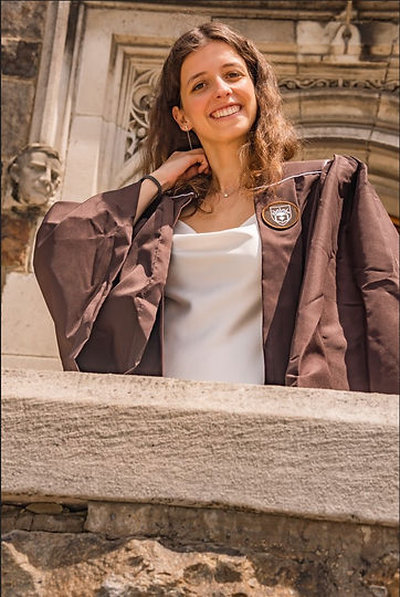
GRADUATION PHOTOGRAPHY

LIGHTS

LIGHTS
LIGHTS

LIGHTS
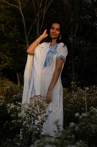
PORTRAIT PHOTOGRAPHY


PROFESSIONAL HEADSHOTS


STUDIO PHOTOGRAPHY


STREET PHOTOGRAPHY


EVENT PHOTOGRAPHY


ILLUSTRATIONS
INK DRAWINGS

COLORED DRAWINGS

LIGHTS
SEQUENTIAL ARTWORK

LIGHTS

LIGHTS

LIGHTS
VIRAL WEBCOMICS


SOCIAL MEDIA PRESENCE
Online, I operate under the pen name, Monitor Comics. I am a freelance digital illustrator, a former published graphic novel author, and video content creator. On Youtube, I have accumulated over 87,000 subscribers and over 6.6 million total channel views.
I have been sponsored by numerous companies and worked with many brands
Video Type 1: Product Reviews
As a published comic book artist, my Youtube channel is dedicated to educational videos centered around comic book development. One aspect of creating a high-quality graphic novel is finding the right tools.
I review digital art tablets, traditional art tools, digital art software, free/premium services, and art courses.
Video Type 2: Comic-Making Process
My channel is dedicated to helping aspiring storytellers grow quickly. Using my knowledge gained through years of trial and error, I create informative videos centered around comic-book-making topics.
Video topics range from creating concept art, creating storyboards, scripting a comic, and designing pages.
Video Type 3: Industry Interviews
If there is a topic or lesson that I do not feel I am qualified to speak on, I like to reach out to other content creators, industry professionals, or leaders in the space to share their knowledge with my audience
These guests range from Hollywood writers to professional artists who work with DC Comics/Marvel
Video Type 4: Commentary
I like to research trending topics or discussions that happen in my niche. I will talk about breaking news, highlight new social media strategies, and highlight new resources as they become available.
Depending on the topic of the video, I may take paid sponsorships or promotions from companies/brands.


Companies I've Worked With:
